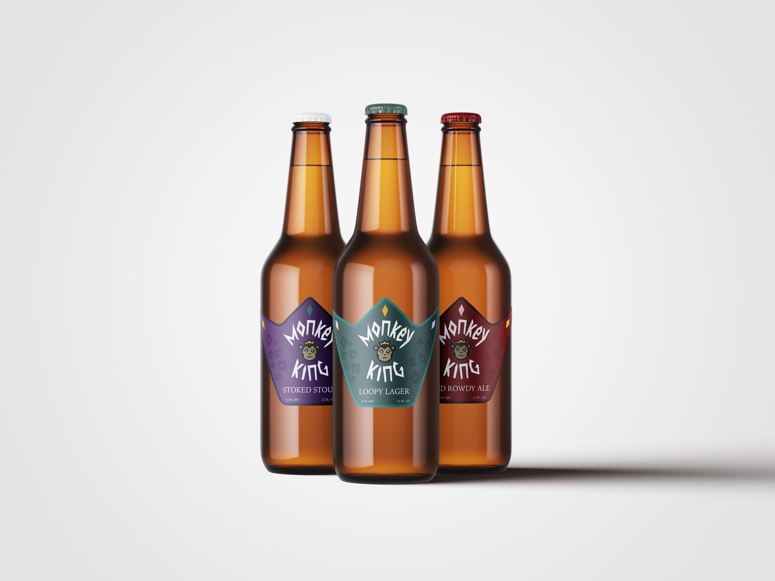
Monkey King is a brewery that is looking to rebrand their look and appeal to a younger audience. With this the objective was to recreate a new logo along with a design for three beer labels. Each one must be slightly different to differentiate between the different types of beer, a stout, ale, and a lager. Each one has a different color and gem color to match the color theme for each label.
Design Process:

The sketch process showcasing different design approaches to include a more fun appearance for the brand.
This became the final result of the logo. the typography was manipulated to go around the logo.

This is the first draft of the designed beer labels. The pattern had overtaken the background and the diamonds on the tips of the crown shape had all been one color.

The pattern was minimized and to put the focus on the logo and to make the type into sans serif.

The pattern was minimized and to put the focus on the logo and to make the type into sans serif. I placed a more dark blue green to not appear as bright, but more cool toned.

The pattern was minimized and to put the focus on the logo and to make the type into sans serif. I placed a more deep purple with a darker purple to outline the label.
Final Mockup: